You've got a website. It looks decent. People are visiting. But your inbox is quiet.
This is one of the most common frustrations I hear from small business owners, and the good news is that it's usually fixable. In most cases it comes down to a handful of specific things, none of them complicated, but all of them worth checking.
Does your website have a clear call to action?
This sounds obvious, but most websites don't do it clearly enough.
Every page on your site should have a next step, a button, a link, something that points a visitor toward getting in touch. If someone reads your about page and finds it interesting but there's no prompt to take action, they'll close the tab and move on. Not because they weren't interested, but because you didn't tell them what to do next.
Go through your site and count how many places direct someone to your contact page. If the answer is one, usually a link buried in the navigation, that's not enough. People need to be guided, and they need to be guided at every opportunity. Here's a real example, a landing page I designed for a client, showing exactly where the calls to action sit and what they're doing at each point in the page.
A real client landing page, every CTA highlighted.
Does your website build trust with visitors?
Think about the last time you hired someone to do work in your home. A decorator, a plumber, a builder. You probably didn't just pick the first name you found, you asked a friend for a recommendation, read some reviews, or looked for some evidence that other people had used them and been happy.
The same applies to almost every industry. People don't contact businesses they don't trust yet, and trust online is built through social proof, reviews, testimonials, case studies, evidence that real people have worked with you and had a good experience.
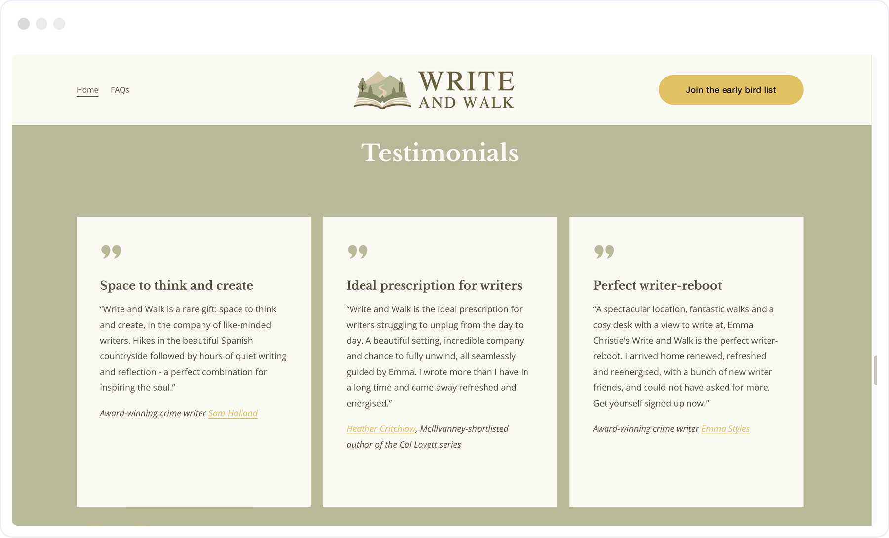
If your website has no testimonials, or they're tucked away somewhere nobody looks, that's likely contributing to the silence. A genuine review from a real client, placed where people will actually see it, does a lot to encourage people to work with you.
The most effective place for social proof is wherever someone is closest to making a decision. A short snippet, a single line and a name, directly beneath your hero CTA is one of the highest impact changes you can make to a homepage. It doesn't ask someone to stop and read, it just quietly signals that other people have trusted you and been happy they did. Further down the page, after someone has seen your work and understood what you do, a fuller review answers the final question, "but have they actually done this for someone like me?" Both placements are doing different jobs, and both are worth having.
Is your contact form asking for too much?
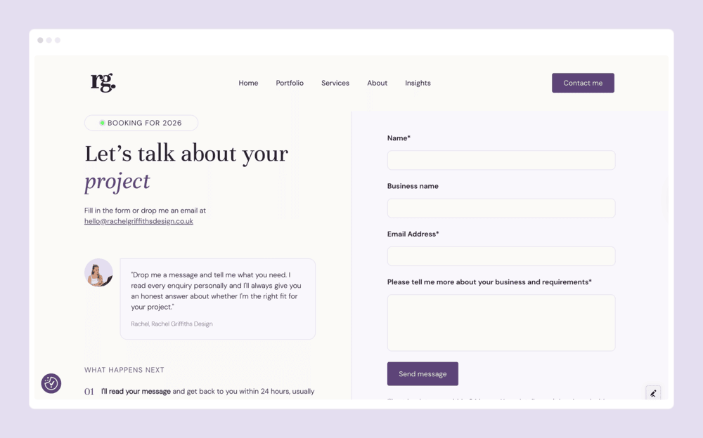
Most contact forms are longer than they need to be. Name, email, phone number, address, how did you hear about us, describe your project in detail, by the time someone reaches the end they've either lost patience or talked themselves out of it.
For most small businesses, you need two things from an initial enquiry: a way to understand roughly what someone needs, and a way to get back to them. That's it. A name, an email address, and a brief description of what they're looking for. Everything else can wait for the actual conversation.
Every extra field on a form reduces the number of people who complete it. Keep it short.
On this point, you should absolutely include your contact details prominently both on the contact page and in the footer. For some people, completing a form is still too much to ask, and they just want to ping off an email quickly and have confirmation in their sent emails that it's been sent.
Is your website copy speaking to your ideal client?
Read your homepage copy back to yourself and ask honestly: does this sound like it's written for the person I actually want to hire me, or does it sound like what I thought a website was supposed to say?
A lot of small business websites end up full of generic language, "passionate about delivering results," "client-focused approach," "dedicated to excellence",that says nothing specific to anyone. Your ideal client lands on the page, reads it, and feels nothing in particular.
The fix is specificity. Who is this person? What are they struggling with? What do they actually need? When your copy speaks directly to that, the right people recognise themselves in it and the wrong people self-select out. Both of those outcomes are good.
Your photos matter here too. If your imagery is generic stock photography that could belong to any business, it's not helping people understand what you actually do or who you actually are.
Have you tested your contact form?
This one sounds so obvious it barely feels worth mentioning, and yet it's more common than you'd think. Fill in your own contact form and check that the submission actually arrives somewhere. Not just that the success message appears on screen, but that the email lands in your inbox and doesn't go straight to spam.
If you've never done this, do it today. A broken contact form is an invisible problem, visitors try to get in touch, nothing happens, and you never know.
Have you looked at your site on a phone?
More than half of all web browsing now happens on mobile, some industries are closer to 70 or 80 percent. Which means there's a high chance that most of the people visiting your site are doing it on their phone.
Open your website on your phone and scroll through it honestly. Is it easy to read? Do the buttons work? Is the text a comfortable size? Can you find the contact page without hunting for it?
If the answer to any of those is no, a significant portion of your potential clients are landing on a broken or frustrating experience and leaving before they ever get to enquire. A site that looks great on a desktop but performs badly on a phone is not doing its job.
None of these are difficult fixes. Most of them take an afternoon rather than a redesign. But they make a real difference, because a well-designed site that doesn't convert is just an expensive brochure.
If you've worked through this list and something still isn't clicking, I'm always happy to take a look and give you an honest opinion on what might be getting in the way.
FAQs
The most common reasons are a lack of clear calls to action, no social proof like reviews or testimonials, a contact form that asks for too much, or copy that doesn't speak directly to the right person. Most of these are straightforward fixes that don't require a full redesign, just a fresh pair of eyes on the right things.
More than most people think. Every page should have at least one clear next step pointing visitors toward getting in touch. A single link buried in the navigation isn't enough, people need to be guided, and they need that guidance at multiple points throughout the page.
Yes, social proof is one of the most effective trust signals you can have on a website. People are far more likely to get in touch if they can see that real clients have worked with you and had a good experience. A genuine review placed somewhere prominent does more for your enquiry rate than almost any design change.


%20(1).jpg)