
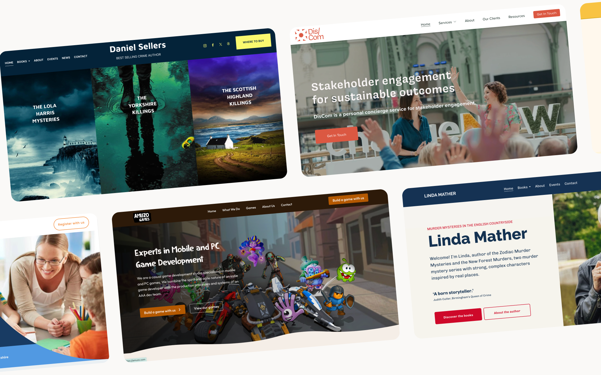
How to write website copy that actually sounds like you
One of the biggest hurdles people face when building a website isn't the design, it's how to write website copy. It's the blank page that appears when it's time to write the words.
When we sit down to write about our own businesses, we feel the pressure to sound "professional." That usually leads to one of two things: either we don't know where to start, or we write far too much trying to prove our value. Neither serves the person reading it.
Your website copy doesn't need to sound like a brochure. It needs to sound like you, clear, specific, and written for the person you actually want to work with.
How to find your brand voice for your website
Before you type anything, step back and ask yourself: if someone met my business for the first time, how would it speak?
Not what it would say, how it would say it. Is it warm and conversational? Direct and confident? Calm and considered? There's no right answer. The goal is to find the tone that feels most like you and stay consistent with it, across every page, every heading, every button.
When you know your voice, the writing gets significantly easier. You stop second-guessing whether something sounds "professional enough" and start asking whether it sounds like you.
How to structure your website copy
A common trap is thinking you need to cover everything. You don't. In fact the more you try to say, the less people take in (a bit like a conversation when someone just talks at you).
Instead of filling every inch of your homepage with words, think about what each section actually needs to do:
The opening: one clear headline that says what you do and who you do it for. Then a single next step.
Your work: show three to six projects. Don't just describe what you built, explain why it mattered to the client.
Your about section: this is where personality earns its place. One or two paragraphs that feel human rather than corporate. Something that makes someone think "I like this person."
Your process: three or four simple steps. When people know what to expect, the anxiety of reaching out disappears.
How website copy affects your SEO
This is worth knowing, even if SEO isn't your priority right now.
When your headings use plain, specific language, the kind your clients actually use when they're searching, search engines can understand what you do and who you do it for. When your paragraphs are short and your pages are easy to navigate, people stay longer. Google notices that.
Clear, simple language is also more accessible, easier for people using assistive technology, easier for people reading in their second language, easier for our ever shortening attention spans.
Writing well for humans and writing well for search engines are, increasingly, the same thing.
One last thing
Design can only do so much. The strongest layouts in the world can't rescue vague, corporate copy. But when the words are honest and specific, the design can breathe, the hierarchy makes sense, the white space feels intentional, and the whole thing feels considered.
Your copy doesn't need to be perfect. It just needs to be genuine.
If you're stuck, start with this: write one sentence that explains what you do, who you do it for, and why it matters. Everything else follows from that.
FAQs
Start with your tone of voice, how your business would speak if it walked into a room. From there, focus on being specific rather than comprehensive. Each page needs one clear purpose, a headline that says what you do and who for, and a single next step. Write for the person you actually want to work with, not for everyone.
It depends on your budget and how confident you feel writing about your own business. Many people find it easier to write their own content with some structure and guidance, and the result often feels more authentic because it's genuinely in your voice. A web designer can help shape and fit your words into the right places on the page even if they're not perfectly polished.
As long as it needs to be to answer the question and nothing more. Homepage copy should be concise, most people scan rather than read. Service pages can go into more detail because someone reading them is already interested. The test is whether every sentence earns its place. If you can remove it without losing anything important, remove it.

%20(1).jpg)