%20(1).jpg)
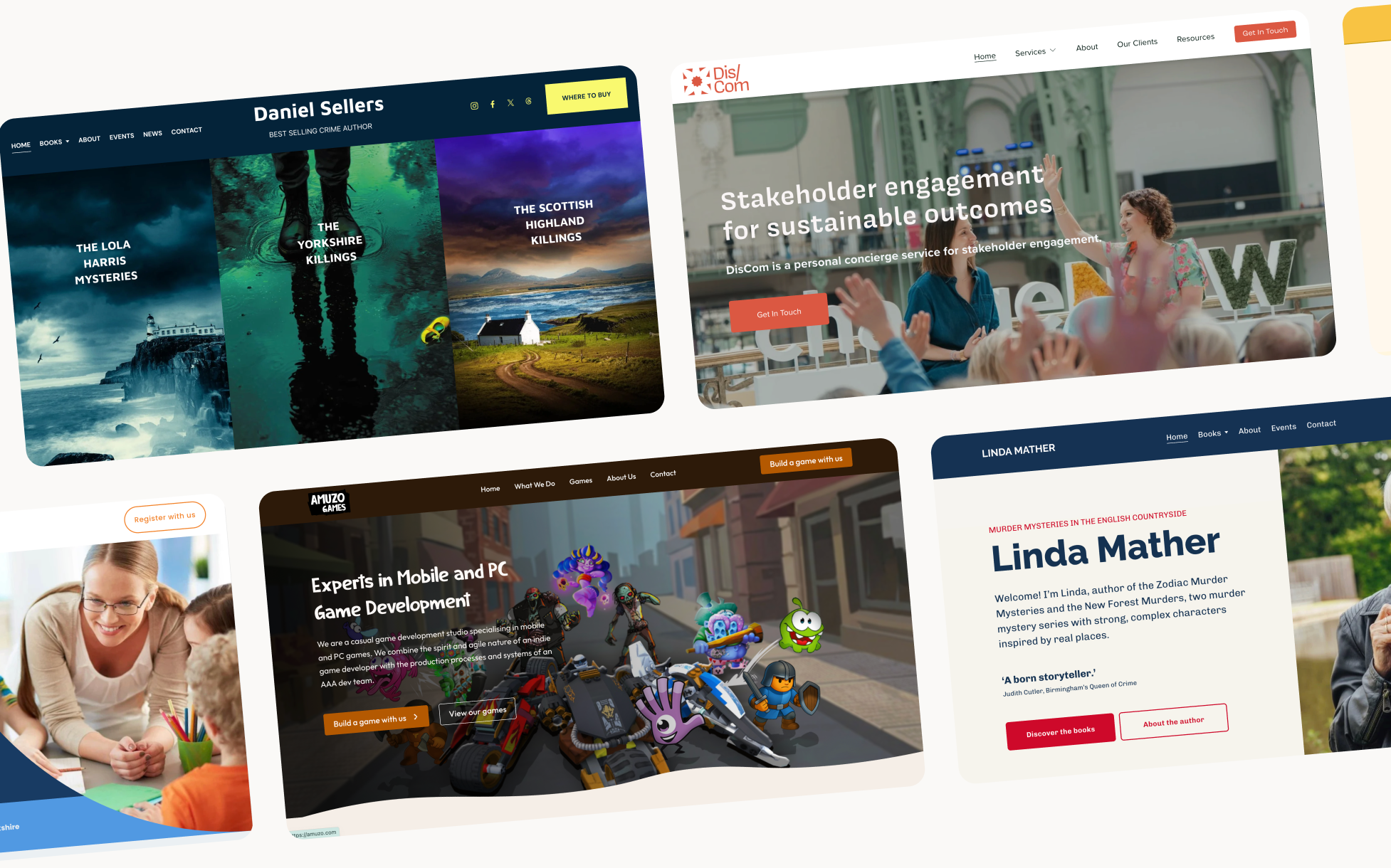
Why how your website looks affects whether people act
I studied psychology before I became a web designer. At the time I didn't think the two had much to do with each other. I was wrong.
The more I've worked on websites, the more I've realised that understanding how people actually behave is the most important thing I bring to a project. Not the tools I use, not the platforms I build on, not even the aesthetic decisions, but the thinking underneath all of it. How people move through a page, what makes them hesitate, what makes them trust, what makes them act.
Without that thinking a website is just a brochure sitting unread. It might look beautiful. It might reflect the brand perfectly. But if it isn't designed around how humans actually process information, it won't do its job.
Here's what I actually consider when I'm designing a site.
Building trust before anyone reads a word
Trust is the first thing a website either establishes or fails to establish, and it happens faster than most people realise. Research suggests people form an impression of a website in around 50 milliseconds. Before they've read your headline, before they've seen your portfolio, before they've checked your prices, they've already decided whether this feels credible or not.
That impression is built almost entirely on visual signals. A clean, considered layout signals professionalism. Consistent typography signals attention to detail. Good use of white space signals confidence, you're not trying to fill every inch because you don't need to.
This is why design decisions that seem purely aesthetic, the spacing between elements, the weight of a heading, the amount of breathing room on a page, are actually trust decisions. They're giving your visitor a good first impression and telling them, before they consciously register it, whether you're worth their time.
Humans like humans
One of the most consistent findings in psychology is that people respond to other people. We are wired to look for faces, to read expressions, to make judgements about whether someone is trustworthy based on how they present themselves.
On a website this means real photos of real people consistently outperform stock images. Not because they're better quality, often they're not, but because they're human. A photo of you, in a real space, doing real work, tells a visitor far more than a polished stock image of someone who looks like a model pretending to be a business owner.
It also means your about page matters more than most people think. People don't just buy services, they buy people. A page that feels genuinely like you, that has some warmth and specificity to it, that makes someone feel like they know a little bit about who they're going to be working with, that page is doing important conversion work whether it looks like it or not.
And to practice what I preach. Here's me, because apparently a real photo builds more trust than a stock image of someone looking thoughtfully at a laptop.

Reducing cognitive load
Cognitive load is the mental effort required to process information. The higher the cognitive load, the more energy someone has to spend just understanding your page, and the less energy they have left to actually make a decision.
Most websites ask too much of visitors. Too much text, too many options, too many competing elements all demanding attention at the same time. The result is that visitors feel vaguely overwhelmed without being able to articulate why, and they leave.
Good design reduces cognitive load by making things obvious. One clear heading that says what you do. One primary action to take. A visual hierarchy that tells the eye where to look first, second, third. White space that gives each element room to land rather than crowding everything together and making everything equally important, which essentially makes nothing important.
The goal is that someone should be able to understand what you do, who you do it for, and what to do next, within a few seconds of landing on your homepage. Not after reading everything. Within a few seconds of landing.
How we actually read, Z patterns, F patterns and visual hierarchy
People don't read websites the way they read books. They scan. Eye tracking research has consistently shown that online readers follow predictable patterns, and designing against those patterns means your most important information gets missed.
The F pattern is one of the most documented,people read across the top of a page, then scan down the left side, occasionally reading across again when something catches their eye. This means your most important content should be front-loaded, the beginning of your headlines, the left side of your page, the top of your sections, because that's where eyes naturally travel.
The Z pattern is similar and applies particularly to simpler layouts, the eye moves across the top, diagonally down to the left, and then across again. Which is why hero sections often work well with the heading on the left, a supporting image on the right, and a CTA at the bottom, it maps onto how the eye naturally moves.
Understanding these patterns doesn't mean rigidly following them, it means knowing where attention naturally falls and making sure your most important elements are positioned to benefit from it.
Colour psychology
Colour affects mood, trust, and decision-making in ways most people don't consciously register, which is exactly what makes it so powerful in design.
Blue communicates trust and calm, which is why it's used extensively in financial services and healthcare. Green communicates growth, health, and permission, which is why it's the default colour for "go" and "yes" buttons. Red communicates urgency and importance, used well it draws the eye, used poorly it creates anxiety.
For small businesses the most important colour decisions aren't about following these rules rigidly, they're about consistency and intention. A brand that uses colour consistently across every touchpoint feels more professional than one that makes random choices. And a CTA button in a colour that contrasts with the rest of the page will always outperform one that blends in, because contrast makes it visible within the rest of your content.
Colour also affects accessibility. Low contrast text, light grey on white, for example, isn't just aesthetically questionable, it's genuinely difficult to read for a significant portion of your visitors. Good colour choices are both psychologically considered and practically accessible.
Guiding people through a website, the path you design for them
All of this, the trust signals, the human elements, the cognitive load reduction, the reading patterns, the colour choices, comes together in the idea of a designed user journey.
A well-designed website doesn't just display information. It guides someone through a specific path. It decides what they see first and what impression that makes. It earns enough trust that they keep reading. It reduces the effort of understanding, so their energy is available for deciding. It puts the right information in the right place at the right moment. And it makes the next step so obvious that taking it feels natural rather than effortful.
This is the difference between a website that looks good and a website that works. The looking good part is visible. The psychology underneath it is invisible, and that's exactly how it should be. When good design is working, no one notices. They just find themselves understanding, trusting, and acting.
That's what I'm trying to build every time I work on a website.
FAQs
Psychology-led web design means making decisions based on how people actually behave online, how they process information, what builds trust, what reduces friction, what makes someone act. Rather than designing based purely on aesthetics or trends, every decision has a reason rooted in human behaviour.
Yes, colour affects trust, mood and attention. More practically, contrast between your background and text affects readability, and contrast between your CTA button and the rest of the page affects whether people notice it. Consistent, intentional colour use signals professionalism in ways visitors register without being able to articulate.
No, and it's worth being clear about that. Using psychological principles in design isn't about tricking people into doing things they don't want to do. It's about removing the friction between someone who genuinely wants what you offer and the moment they get in touch. Making things clear, building trust, reducing confusion, none of that is manipulation, it's just good design