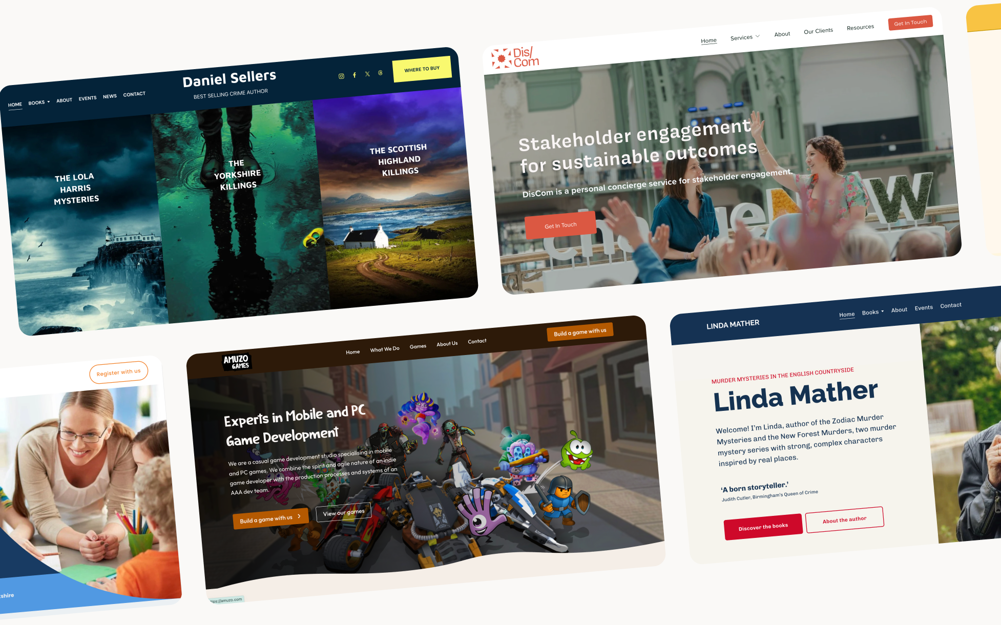
What makes a good small business website? (and what nost get wrong)
Most small business websites look fine. A logo at the top, some pages in the navigation, a contact form at the bottom. They exist. They're not embarrassing. But they're not doing much either, and the owner has often been quietly wondering why.
A good small business website isn't just one that looks professional. It's one that works, that earns trust quickly, guides visitors towards an action, and reflects the business behind it so accurately that the right people feel it immediately.
That's harder to build than it sounds. Here's what it actually takes.
Start with the question most designers skip
Before you make any design decisions, there's one question worth really considering - "what action do you want visitors to take when they visit your site?"
Not "what do you want them to know", that's a different question with a different answer. But, what action matters? Book a call. Send an enquiry. Buy a product. Sign up to a list. There's usually one thing that matters more than the rest.
A website that tries to guide visitor to every possible action at once usually prompts none of them. Getting clear on this goal can shape ceverything that follows, the layout, the copy, the calls to action, the journey a visitor takes from arriving to leaving.
Most websites are built without ever answering this question clearly.
First impressions happen before anyone reads a word
Research puts it at around 50 milliseconds. That's how long it takes a visitor to form a first impression, before they've read a single word.
What they're responding to isn't your services or your pricing. It's visual: layout, colour, typography, whitespace, photography. The overall feeling the site gives off. Is this professional? Is this for me? Can I trust this?
Clean layout, consistent typography, and genuine photography all read as trustworthy. Clashing fonts, crowded pages, and stock images that look like stock images read as the opposite, even if everything technically works.
A site that's almost right but slightly off creates a low-level unease that visitors can't always name but definitely feel. They leave. They don't know why. But they do leave.
The first job of a good small business website is to clear that hurdle in under a second.
One clear job. One path to get there.
Once a visitor has decided to stay, they need somewhere to go. A well-designed site has one clear primary action that stands out from everything else on the page. Not five calls to action competing for attention. One.
And then it makes the path to that action as frictionless as possible.
That means thinking carefully about where visitors land, what they read first, where their eye goes next, and what question they need answered before they'll take the next step. Every section exists because a visitor at that point in the page has a specific question, and that section answers it.
When it's done well, none of this is visible. You just find yourself understanding what to do and doing it. When it's missing, you wander around the page for a bit and then leave.
The words do more work than the design
The best-designed site won't convert if the copy is vague, jargon-heavy, or written for the business rather than the visitor.
Good website copy speaks to one person. It addresses what they're worried about. It explains what you do in language they'd actually use. It earns trust by being specific, not "bespoke solutions tailored to your needs" but something concrete about what you do, who you do it for, and why it works.
Copy is where most small business websites fall down,not because business owners can't write, but because writing about yourself is genuinely hard. It's easy to end up describing what you do from the inside, when visitors need to understand it from the outside.
The design draws people in. The words make them stay and decide.
It feels like the person behind it
Small businesses have an advantage over large companies: they're personal. There's a real person behind the work, with a genuine point of view, a specific way of doing things, and a story that matters to the right clients.
A website that captures that, that actually feels like you, is worth far more than one that just looks professional. Clients don't just hire skills. They hire the person. They need to feel something about you before they'll reach out.
That's not about having a flashy design. It's about making genuine choices. Imagery that's real rather than stock. Copy that sounds like a person rather than a brochure. An about page that's honest rather than a list of credentials.
Generic templates can't do this, they're built to work for anyone. A site that works for you is built around the specific things that make your business yours.
It works on a phone and it loads fast
More than half of web traffic is now on mobile. For many small businesses it's considerably more than that.
A site that isn't properly optimised for mobile isn't half a website, it's a website that's broken for most of the people who visit it. Text that's too small, buttons that are hard to tap, images that push the layout sideways. Any of these lose visitors before they've had a chance to decide whether they want to hire you.
Load speed matters for the same reason. Every second of delay increases the chance someone leaves. Both of these are non-negotiable on a professionally built site. If you're not sure whether yours passes, Google's PageSpeed Insights will tell you in thirty seconds.
You can run it yourself after launch
A good small business website isn't just good on day one. It's good six months later, when you've added new services, updated your pricing, and written a few blog posts.
That means it needs to be manageable, by you, without calling a developer every time something needs changing. The platform choice matters here, and so does how the site is built. A site that's technically impressive but impossible for a non-designer to edit is a liability, not an asset.
I build sites so that my clients understand them. At handover I walk through exactly how to make the changes you'll actually need to make. The goal is that you leave feeling confident about your own site, not dependent on me for basic updates.
What most small business websites actually get wrong
Here's what I see most often on sites that aren't working:
No clear primary action - multiple calls to action competing for attention, with none of them winning. Visitors don't know what to do next, so they leave.
Copy written for the business, not the visitor - lots of information about what you do, not much about what the visitor gets or why it matters to them.
Stock photography that feels impersonal - one page of genuine photos does more than a library of generic imagery.
A design that looks like a template - not because templates are bad, but because an unmodified template looks like an unmodified template. Visitors feel the difference.
An about page that reads like a CV - clients want to feel like they know you. A list of qualifications doesn't do that. A paragraph that sounds like a real person does.
Built for launch, not for life - a site the owner can't update themselves goes stale quickly. Stale content is a trust signal, just not the kind you want.
FAQs
It depends on the complexity — but for a professionally designed small business site in the UK, you're typically looking at £800–£2,500 from a freelance designer. Agencies charge more.
Only if you'll actually use it. A blog that hasn't been updated in two years suggests a business that's gone quiet — which isn't the impression you want to give. If you enjoy writing and have things worth saying, a blog can help with SEO and give visitors a reason to return. If you don't, skip it.
Any time something changes — your services, your pricing, your availability, your portfolio. Beyond that, it depends on your content strategy. The most important thing is that it's accurate. An outdated site is worse than a simple one.

%20(1).jpg)
